technology + type = an ephemeral, beautiful, and simple win. in the words of martin venezky: it's beautiful and then it's gone.
Much more over on Dezeen

Showing posts with label graphic design. Show all posts
Showing posts with label graphic design. Show all posts
Wednesday, January 29, 2014
Wednesday, January 8, 2014
new work: sneeze on a beat!
This is a logo I did for a music blog my sister is starting. "Sneeze on a Beat" is taken from a Beyoncé song on her new album. Don't ask me which one. It's kind of an interesting phrase on its own though! Both "sneeze" and "beat" are kind of musical, in that they are both noises heard and interpreted by human ears.
The mark is an interpretation of the components that make up music: The "woosh!" and "blam!" marks represent rhythm and percussion, while the colored letterforms stand in for melody and lyricism.

Alternative Lock-up:
Monogram:

Proud of my little sister for starting up something of her own. Stay tuned for more updates!
The mark is an interpretation of the components that make up music: The "woosh!" and "blam!" marks represent rhythm and percussion, while the colored letterforms stand in for melody and lyricism.
Alternative Lock-up:

Monogram:
Proud of my little sister for starting up something of her own. Stay tuned for more updates!
Monday, January 6, 2014
Freelancing: how does it work? /// #1
Here's a post for anyone interested in freelance graphic design. If that doesn't apply to you, then surf on my friend. Let the waves of the Internet carry you to more exotic (and probably more interesting) seas.
One of my new year's resolutions is to become a self-reliant, fully automated, well-oiled graphic design machine. I've started to research how freelancing works, and I've found that there's lots of advice out there, and not all of it is good. In fact, not all of it makes sense.
Enter this blog!
I'm hoping to write a series of posts as a way of clarifying how a typical project works for a freelance designer. Maybe these will become a resource for others like me, who are trying to make sense of it all. Consider this Brent's Adventures in Freelancing #1.
An Overview
Here's what used to think a typical project looked like:

It's not a false representation, but after a little research and experience, I discovered that it's terribly oversimplified. In reality, a project is much more multi-faceted:
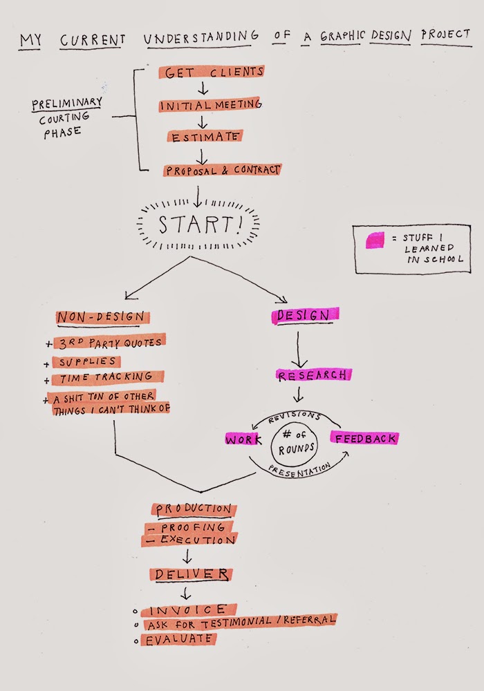
I feel like I can break a project down into three phases: The preliminary stuff, the actual work, and the delivery. What surprises me is how little of this process I know about. In school I learned how to do the actual work, but I know next to nothing about the other two phases. Freelancing is much more than design: there's business, project management, and communication involved too.
Next time I write I'll delve into what I've learned about the preliminary stuff. I've got more than a few questions: What needs to be learned at an initial client meeting? How do you create an estimate? What are the parts of a proposal and a contract, and why are they necessary?
I'm (hopelessly, impossibly) new to all of this. Room for improvements abound. If you have any criticisms, advice, questions, or cat gifs, please leave them in a comment. Let's work this thing on out!
Cheers,
B
One of my new year's resolutions is to become a self-reliant, fully automated, well-oiled graphic design machine. I've started to research how freelancing works, and I've found that there's lots of advice out there, and not all of it is good. In fact, not all of it makes sense.
Enter this blog!
I'm hoping to write a series of posts as a way of clarifying how a typical project works for a freelance designer. Maybe these will become a resource for others like me, who are trying to make sense of it all. Consider this Brent's Adventures in Freelancing #1.
An Overview
Here's what used to think a typical project looked like:
It's not a false representation, but after a little research and experience, I discovered that it's terribly oversimplified. In reality, a project is much more multi-faceted:
I feel like I can break a project down into three phases: The preliminary stuff, the actual work, and the delivery. What surprises me is how little of this process I know about. In school I learned how to do the actual work, but I know next to nothing about the other two phases. Freelancing is much more than design: there's business, project management, and communication involved too.
Next time I write I'll delve into what I've learned about the preliminary stuff. I've got more than a few questions: What needs to be learned at an initial client meeting? How do you create an estimate? What are the parts of a proposal and a contract, and why are they necessary?
I'm (hopelessly, impossibly) new to all of this. Room for improvements abound. If you have any criticisms, advice, questions, or cat gifs, please leave them in a comment. Let's work this thing on out!
Cheers,
B
Friday, January 3, 2014
Do yourself a favor
and get lost in Hort's website for a while. Playful, genre-defying design work. And a lot of it. Don't forget to check the about page, where you can find this statement:
Role models in my book. A couple examples of their work:


Thanks to Need Supply's Human Being journal for the tip off.
HORT - a direct translation of the studio's mission. A creative playground. A place where 'work and play' can be said in the same sentence. An unconventional working environment. Once a household name in the music industry. Now, a multi-disciplinary creative hub. Not just a studio space, but an institution devoted to making ideas come to life. A place to learn, a place to grow, and a place that is still growing. Not a client execution tool. HORT has been known to draw inspiration from things other than design. √
Role models in my book. A couple examples of their work:


Thanks to Need Supply's Human Being journal for the tip off.
Monday, December 30, 2013
New Work - Clay Spokes
Clay Spokes is a band that plays country, folk, and old-fashioned tunes. They also happen to be good dudes and my good friends. This self-titled album contains original songs penned by Son House II and Tyler Longest, and though it isn't available just yet, you can follow the band on facebook for updates and information on future shows. Good local music, yeah yeah!

p.s. I'm also playing a show with the Spokes this Saturday, January 4th, at Carytown Bistro. Stop by and say hi!


p.s. I'm also playing a show with the Spokes this Saturday, January 4th, at Carytown Bistro. Stop by and say hi!

Thursday, December 26, 2013
neato times twenty: Jaime Zuverza
Jamie Zuverza's work is effortlessly cool, in that fuck-it, indulge your deepest, weirdest urges kind of way. His posters reference (but never blindly emulate) Grindhouse, Creepshow, that sweet Buzzcocks art, Ukiyo-e, and more. It's great to see someone being so reckless, playful, and subversive with their poster design. There are a ton of great posters to peep on Jamie's site, and you can read an interview here (via it's nice that).


Here's to a weirder, more prolific 2014.


Here's to a weirder, more prolific 2014.
Monday, August 26, 2013
new project alert
American Design Warrior is a challenge that will test the dexterity, strength, and resolve of two world famous designers. Beware.

Click here to find out more.

Click here to find out more.
Wednesday, March 6, 2013
neato times twenty
In love with these posters designed (and screen printed!) by Ronny Hunger aka Comet Substance.

There's just something satisfying about the color and texture found in ephemera. And, out of left field, there are slick, bold forms made with more modern technology. These juxtapositions make for a delightful, disorienting experience. Reminds me tangentially somehow of the work of Bart de Baets.


via It's Nice That. Check the Comet Substance site and see more goodness here.


via It's Nice That. Check the Comet Substance site and see more goodness here.
Saturday, March 2, 2013
The City I Live In
I am so honored to be a participant in Affiche #1, the poster show currently up at the mOb + Storefront space.

If you have a chance to mosey on down there, you'll find yourself surrounded by massive, colorful, strange, quiet, loud, funny, and serious posters. All of them deal in some way with the theme of "the city I live in."


Here's a little blurb:
Let's keep the poster alive! Let's get 'em out in the streets!
Here is a closer look at my contribution:


Here's a little blurb:
An exhibition of very large posters at mOb + Storefront is opening March 1 from 5 to 9 pm. Designers were asked to create a visual interpretation of the city they live in ranging from New York, Gothenburg, past, present, future, dark, green, Richmond, etc. Styles are diverse, the walls are bright and demonstrate the need to respect the poster as a critical component of our city streets.
Let's keep the poster alive! Let's get 'em out in the streets!
Here is a closer look at my contribution:

Thursday, January 31, 2013
how to get unstuck
Move. former professor Sandy Wheeler gave me this simple but beautiful piece of advice in her conversation with John Malinoski, and Scout (see my previous post).


Sometimes when you're making something you get stuck in terrible molasses swamps. Somehow, you manage to work yourself into corners from which no escape or forward progess can be made. Most of us have experienced those off-days. Feelings on those days range from mild exasperation to existential despair.
The problem of being stuck has been mulled over and talked about by artists, scientists, teachers, musicians, and probably every human being ever. We refer to it as "writer's block", "hitting a wall", or "the well running dry."
How do you get the well wet again? What's the solution?
Sandy's answer was so simple it floored me. Move. Engage your body physically. Take a walk, or dance. Body movement takes you out of a mental space and into the physical one. Striking a better balance between physical and mental activity (aka giving your overheated mega brain the occasional rest) could be just what you need to get unstuck.
Sunday, January 27, 2013
on wearing rabbit ears
I was lucky to see two of my old professors talk last night about their childhoods, old jobs, families, and design. it was a true gift and i'm going to try and spend a little bit of time reflecting on sharing some of the pearls that were given to me last night.
here's one:

John Malinoski spent a little time talking about the small town where he grew up. His father was a coach of all sports, and gave the following advice to his son: don't play the game with rabbit ears. If you think about it, rabbits are always picking up on the slightest vibrations and disturbances around them. While this hyper-attentiveness to one's suroundings has done wonders for the survival of the rabbit species, it does little for atheltes who need focus and resolve in order to play to the best of their abilities.It's amazing how much this advice also applies to people in any sort of creative field. (the parallels between the life of an athlete an the life of a designer are astonishing!) For a creative person looking to flourish and thrive, one has to be able to turn off all the peripheral noise that can surround the work ("What will my colleagues think?", "How will this be received?", or "How does this compare to what has come before?"). Focusing too much on external non-issues is detrimental to quality. Instead one must turn inward, and concentrate on the task at hand.
John Malinoski spent a little time talking about the small town where he grew up. His father was a coach of all sports, and gave the following advice to his son: don't play the game with rabbit ears. If you think about it, rabbits are always picking up on the slightest vibrations and disturbances around them. While this hyper-attentiveness to one's suroundings has done wonders for the survival of the rabbit species, it does little for atheltes who need focus and resolve in order to play to the best of their abilities.It's amazing how much this advice also applies to people in any sort of creative field. (the parallels between the life of an athlete an the life of a designer are astonishing!) For a creative person looking to flourish and thrive, one has to be able to turn off all the peripheral noise that can surround the work ("What will my colleagues think?", "How will this be received?", or "How does this compare to what has come before?"). Focusing too much on external non-issues is detrimental to quality. Instead one must turn inward, and concentrate on the task at hand.
Put another way: we need spend less time listening to the commentating and more time in the gym.
Sunday, October 21, 2012
designer friends:
i've always wanted to know how to do this properly! it might be helpful to you to:
connecting tangent lines
via ragnar freyr's personal blog
Monday, September 10, 2012


Sunday, June 24, 2012
we agonize, we endlessly tweak, because
I had the honor of being one of Law Alsobrook's students when I studied at VCUQ in the spring of my sophomore year. Although it's been two or three years since then, there are things I haven't forgotten about him. He was always full of energy - never in one place for too long, quick to draw a diagram or to scribble notes on the whiteboard. The classes he taught with Leland Hill always seemed to hum with anxiety, excitement, and laughter. Law had high expectations for us students. We had to be dedicated to research, iteration, and making things with intentionality. I look back at that semester now, and I see it as a time when I cut my teeth and began to understand what design is and how it works.
I remember one day Law talked me through a moment of self-doubt and despair. I was designing postage stamps and I wanted so badly to make something meaningful, beautiful, and good. At a certain point in the process I got so stuck and twisted up about these tiny stamps that I broke down. I was beginning to seriously doubt if I was capable of being a designer.
Law told me to trust the process and to not be so hard on myself. He reminded me that they were just stamps, and not the Mona Lisa. He also explained to me that there are naturally going to be moments when you doubt your process and capabilities, and that founduation-shaking mega-existential meltdowns happen from time to time. I remember leaving the studio that day feeling humbled, relieved, and at peace.
Law was one of the first to help me understand what design is and how it works. Here he is again, reminding me and everyone of design's power, intensity, and importance.
Saturday, May 19, 2012
spin magazine and ETC
The one magazine I subscribe to is SPIN. I've always enjoyed their articles and interviews because they give me insight into the nature of musicians / creative people. Spin always shapes issues around a central idea. For example, May / June is "The Loud Issue." It celebrates artists that are advocates of "ear-bleeding modes of expression [...] driven by thought-provoking ideology as much as brute force." I always enjoy their carefully curated content, photography, and illustration. Plus it's always interesting to see who's on the latest cover.

Spin recently gave me one more reason to be a fan when they recently redesigned the entire publication. The new look and format is in my opinion a very smart reaction to the increasing digitization of information. Instead of attempting to emulate or keep up with the music blogs, the publication goes in the opposite direction. It seeks to become a physical, precious, and charming artifact. The printing techniques and the paper are much more physical: You can feel the matte paper in your fingers and see the overlapping inks. The larger format also allows the photographs to be really immersive.


The redesign is not only beautiful, it's smart too. Things like album reviews and news updates have been removed from the magazine and relegated to Spin's site because this type of information is faster and more fleeting. The content in the magazine has been carefully considered for print. The articles are long (in a great way) and more cultural, speculative, and contemplative. I wanted to know who was behind all of this, and I discovered that it was a design firm based in Brooklyn called Everything Type Company, or ETC. Check out their site for some really awesome work for the Walker Art Center, Yale, Dwell, and more.
Hooray for printed matter! Hooray for design that understands and capitalizes on the nature of it's medium!
Sunday, May 13, 2012
a great resource
I remeber being in the thick of this semester and catching a glimpse of friend and fellow designer Matt Stay's buisiness cards. I remeber thinking to myself, "what's that rugged, decorative, typeface with depth?" Matt went on to tell me about the Lost Type Co-Op.

 The Lost Type Co-Op is the first type foundry that allows it's patrons and supporters to name their price for a typeface. This is especially great news for me, a recent college grad (more on that in a bit) with approximately zero pesos in el banco. I do hope that they do alright, these pay-what-you-want sites depend on the goodness of those that can pay if they are able. When you make the choose to pay, you are supporting designers and recognizing quality.
you can visit the site here!
The Lost Type Co-Op is the first type foundry that allows it's patrons and supporters to name their price for a typeface. This is especially great news for me, a recent college grad (more on that in a bit) with approximately zero pesos in el banco. I do hope that they do alright, these pay-what-you-want sites depend on the goodness of those that can pay if they are able. When you make the choose to pay, you are supporting designers and recognizing quality.
you can visit the site here!


Monday, March 12, 2012
ULTRA COOL BEANS
Bart de Baets is one cool fellow. I first came across his work in Elephant Magazine and was really struck by his playfulness and irreverence. I like how he makes meaning by using (or misusing) existing imagery.
He recently did a project with Sandra Kassenaar, where they both became resident artists in Egypt in the midst of the political unrest and revolution of 2011. As a reaction to the environment that surrounded them, they created Success and Uncertainty. From their website:


to visit Bart de Baets' website, click here
He recently did a project with Sandra Kassenaar, where they both became resident artists in Egypt in the midst of the political unrest and revolution of 2011. As a reaction to the environment that surrounded them, they created Success and Uncertainty. From their website:
Being stunned by the political tidal wave flooding the country, the resignation of Hosni Mubarak and the phenomenon of having a curfew — something they had only heard of in World War II stories — the designers found themselves gazing from the sidelines, not knowing how exactly to react to all of this. They asked themselves ‘Would it be arrogant to confront the Egyptians with our assumptions? And ‘isn’t it ignorant to pretend to have a nose bleed?’On Wednesday June 1st 2011 a lightbox will hang outside the Townhouse Gallery announcing the start of the project and showcasing the first of twenty-one posters. During the month of June 2011, each day a new poster will be presented, generating a growing exhibition. The daily changing posters will be seen both in- and outside of the gallery and will, just as newspapers do, show bold statements and gruesome facts, next to light-hearted messages, such as casual observations and rumours that caught Sandra and Bart’s attention during their residency. The content provided by both therefore creates a clash of information that will influence the way one reads a poster. It was this constant dialogue between the designers that lead to Success and Uncertainty.
Their unclear position and the new situation the country found itself in proved to be an inspiring discovery, which eventually lead to the project Success and Uncertainty. The title of this work is an existing headline taken from the 12th of February 2011 front page of The Evansville Courier & Press, a local Indiana newspaper reporting Mubarak’s resignation as the president of Egypt.
Here are a couple of my favorite posters from the project:


to visit Bart de Baets' website, click here
Subscribe to:
Posts (Atom)